If you’re planning a new build or a renovation, chances are, you’ve been immersing yourself in the world of kitchen design, seeking that perfect layout for your dream home. With endless inspiration available online, it’s easy to get lost in the possibilities.
Over the years, our kitchens have evolved from simple food preparation spaces into dynamic, multi-functional hubs of our homes. Thanks to the popularity of open-plan design, the modern Australian kitchen has taken on numerous roles - it’s a place for family gatherings, social catch-ups, and even impromptu office spaces.
Today’s kitchens are sleek, with integrated appliances and concealed components, and the age-old concept of the butler’s pantry has made a significant comeback.
Despite these changes, one fundamental truth remains: a well-designed kitchen is a functional and efficient one. No matter what happens in your kitchen, it is essential that the layout works for you and your situation.
In this guide, we walk you through the essentials of kitchen layout design, starting with the classic ‘work triangle,’ before exploring a range of layout options to suit different spaces and lifestyles.
So let’s jump in and make your dream kitchen a reality.
The ‘Work Triangle’
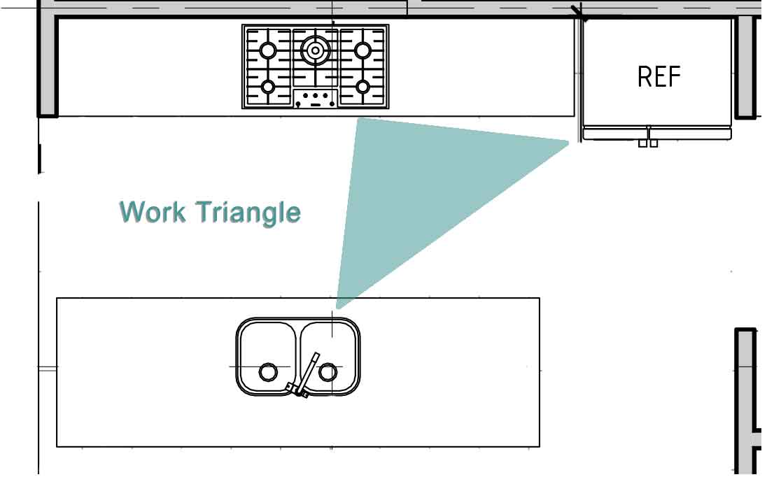
For a long time, kitchen design has concentrated on the work triangle which is the triangle formed by drawing imaginary lines between the centre of each of the main places used within the kitchen: the sink, the fridge and the cook top.
For maximum efficiency, it is suggested that the total distance between each of these areas remains somewhere between 4 and 7.9 metres, with each side of the triangle being between 1.2 and 2.7 metres. Make sure that there are no obstructions in the pathway between each of these areas.
And most importantly, avoid a traffic flow path through the triangle so you’re not bumping into visitors to the kitchen.
With this in mind, it is important to note that the evolution of the kitchen has seen further development of the idea of the work triangle.
As the kitchen is no longer just for the ‘cook’, much kitchen design is trending towards ‘zones’. For example, the ‘cooking’ zone will contain the cooktop and all cooking utensils, oils, spices and items like baking paper will be contained in the same area.
This theory requires careful planning of cabinetry as well as the location of your sink, cooktop and fridge. Read more about kitchen zones here.
The kitchen triangle is a major consideration and will change with the type of layout you decide on.

Kitchen Layouts
There are a number of options to consider when it comes to kitchen layout.
Mostly, you will be guided (or restricted) by the position of your kitchen and how much space you have. Some layouts are more suited to smaller sizes where others could only be considered for a larger area, and this should definitely be taken into account when designing your kitchen.
The most common layouts are as follows:
1. ‘ONE WALL’
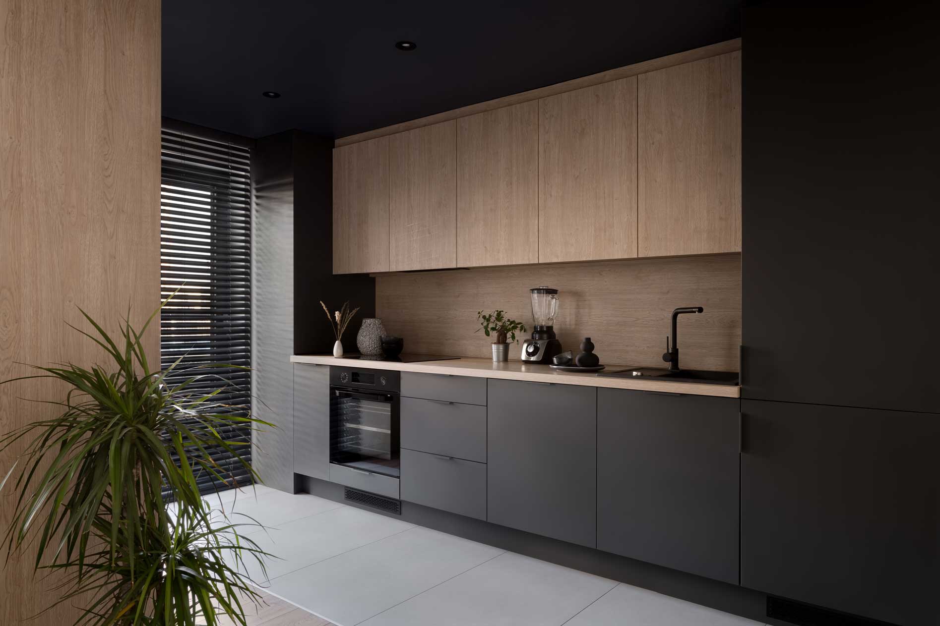
This kitchen is most suited to small apartments and studios because it is the ultimate design for saving space.
Cabinets and appliances are all set along one wall, though sometimes a bench may be introduced, making it more like a ‘Galley’ kitchen.
Other times a dining table may be set near to the kitchen to create efficiency when serving meals.
Where this type of kitchen services small spaces very well, a lack of preparation space can be a disadvantage.

2. ‘THE GALLEY’
This kitchen is essentially two parallel counter tops opposite to each other. One may be set against a full wall, the other just the bench or set against a half wall. Either way, the galley kitchen is a walk through kitchen.
It’s a great space saver with top efficiency potential having its origins in the cramped spaces of ships and aeroplanes where hundreds need to be fed.
In residential spaces, cabinetry can be cheaper because of the absence of awkward corners, but a big drawback is the fact that it tends to be isolated. This can limit interaction with family and guests.

3. ‘THE L-SHAPE’
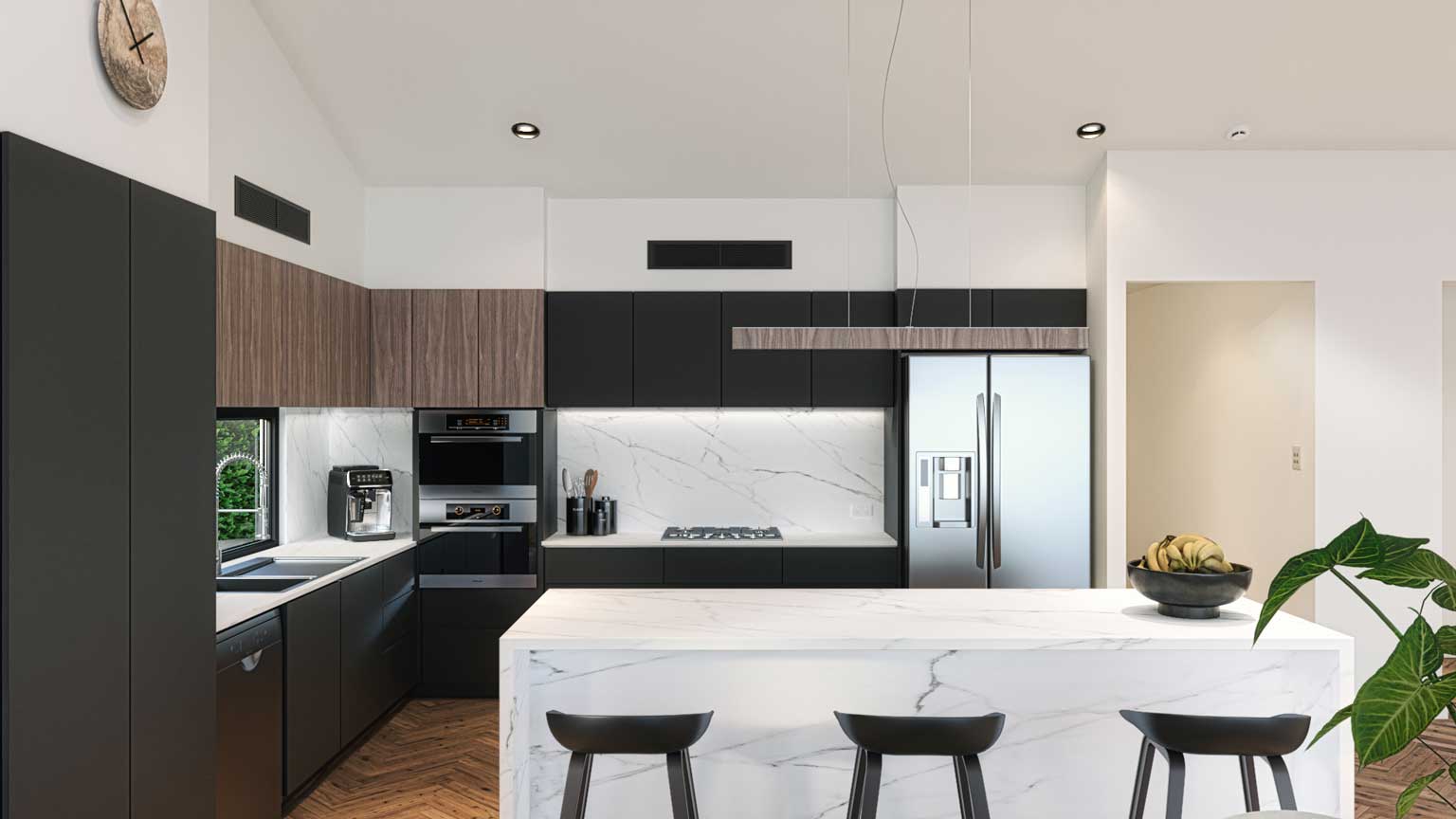
This kitchen enables you to maximise corner space by running bench tops along two adjacent, perpendicular walls, hence forming the ‘L’ shape.
The length of each bench top can vary but be mindful of the distance you create for anyone working in this kitchen. Corners will require some clever cabinetry solutions or a walk in pantry can work here if you have the space.
You can easily create work ‘zones’ in this kitchen and a dining table can be added if required, too.
4. ‘THE ISLAND KITCHEN’
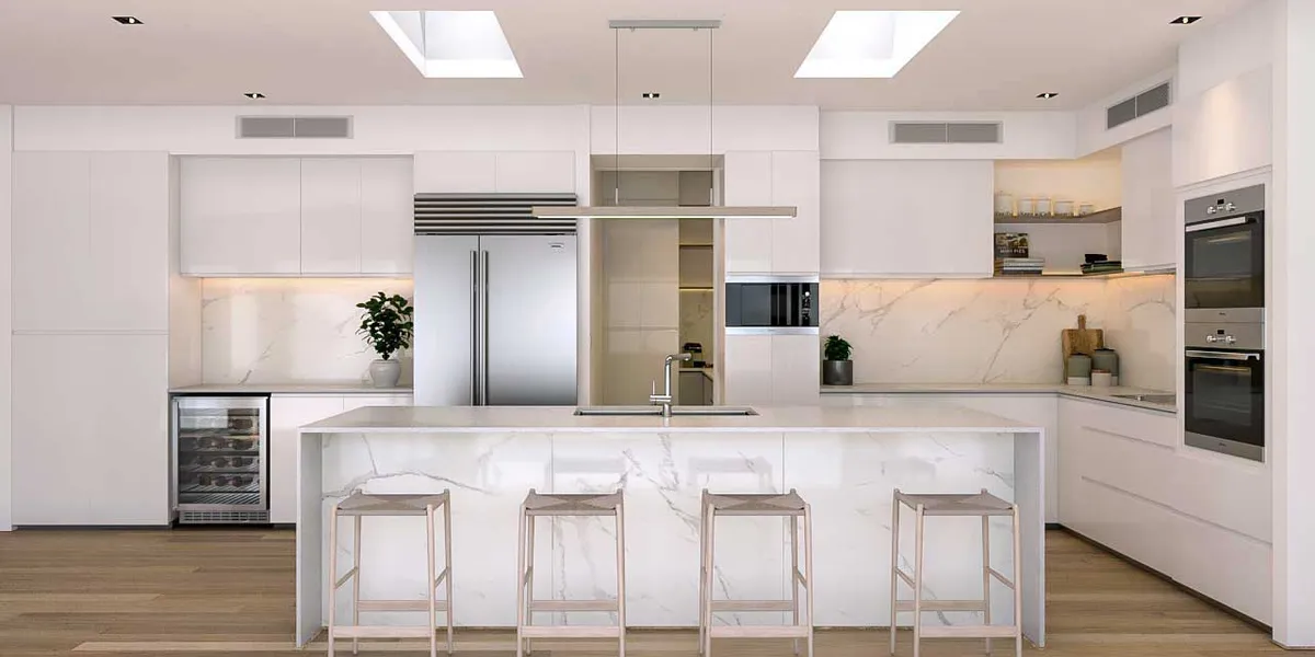
The island kitchen is essentially one in which an island bench is installed – usually in the centre. The ‘island’ is a freestanding cabinet and as such, can be added to some of the other kitchen layouts including the L-shape and the U-shape.
Ultimately it depends on how much space you have.
As a freestanding cabinet, the island can be used in a variety of different ways depending on your needs.
Some island benches double up as a breakfast bar or meals area. Others provide a space for the sink or cooktop, or both depending on size.
As a central focal point for a kitchen, the cabinetry finishes can be different, and pendant lights can be added to make it a feature or enhance the style overall.

5. ‘THE G-SHAPE’ (PENINSULA)
This kitchen is basically an L-shape or U-shape kitchen with a bench that extends out from the cabinetry of one of the walls, forming a G-shape.
Not unlike the island kitchen, the Peninsula offers the opportunity for more bench and storage space and more interaction during meal prep times. In this case, the additional bench space is less likely to accommodate the cooktop or sink.
The G shape is often a great design solution when a wall is removed to open up an area. The bench that juts out forms an entrance to the kitchen as well as extra storage space.
The peninsula can be scaled to work in small or large kitchens.
6. ‘THE U-SHAPE’- (HORSE SHOE)’
The U shape or ‘horseshoe’ kitchen is formed by three connected walls which each offer bench space and cabinetry. This results in more preparation space and more cabinetry for storage.
The U-shape also allows two or more people in the kitchen to cook at the same time, which is a major benefit for a large family or one who entertains a lot.
Depending on the orientation of the U-shape in the space, one of the benches may double up as a breakfast bar or island accessible to guests which keeps cooking social.
While corner cupboards can be seen as a disadvantage of this design, there are several cabinetry solutions that can be utilized to keep corners more usable.
Care needs to be taken with this layout so that the work triangle isn’t too large, resulting in work zones that are too far apart.
The Final Word…
Choosing the right kitchen layout is no easy task. It’s an exercise in balancing aesthetics, functionality, and the unique constraints of your space. It can be overwhelming to consider all the options and how they might fit into your lifestyle.
But remember, a well-designed kitchen doesn’t just look good - it enhances your daily life, streamlining your cooking process and offering a welcoming space for family gatherings and socialising.
Remember the essentials - the work triangle or zoning concepts for maximum efficiency, and layouts that best utilise your space. And, whether you lean towards a one-wall design, a spacious L-shape, or a versatile U-shape, your kitchen layout is the foundation of your dream kitchen.
If you’re still unsure about which kitchen layout will best suit your needs, don’t hesitate to reach out to us. We’re here to help guide you through the design process, ensuring you make the most of your space and create a kitchen you’ll love for years to come.
Contact us today to take the first step towards your dream kitchen design.

