
Part 2: Colour Psychology – Designing Visual Environments That Support Learning, Mood and Focus in Gold Coast Schools
This is Part 2 of our four-part series on designing effective educational environments. Read Part 1 on Acoustics or view the series introduction to learn more about our approach to educational architecture across the Gold Coast.
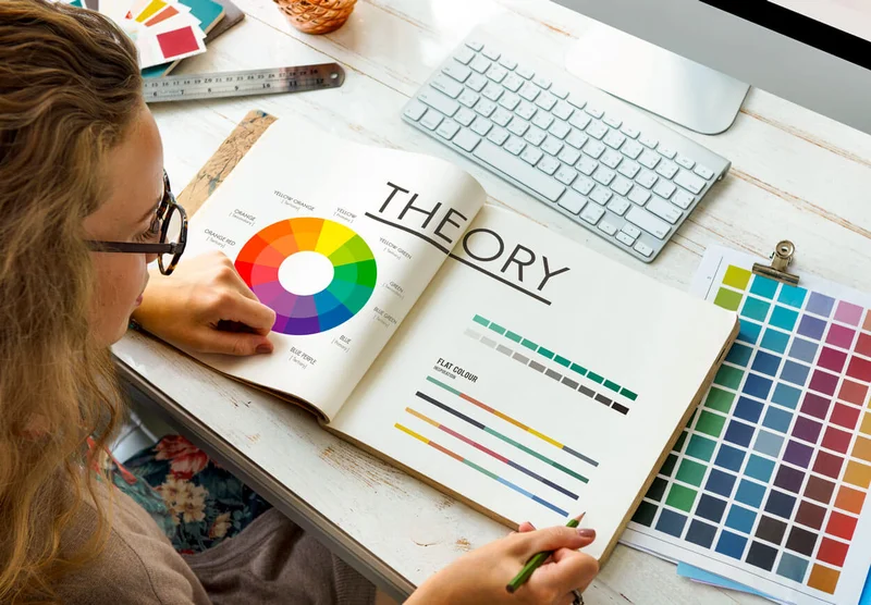
Colour is More Than a Finish
In educational environments, colour isn’t just about aesthetics — it’s a functional design element that affects how students feel, behave and learn. The science of colour psychology has evolved beyond marketing and branding into fields like environmental psychology, architecture, and education. When applied thoughtfully, colour can enhance focus, reduce anxiety, and even support memory retention — but when misused, it can create sensory overload, agitation, or disengagement.
In short: colour is not decorative, it’s strategic. A strong understanding of colour psychology allows architects to align visual environments with the function and emotional needs of each space, particularly in learning settings where cognitive load and emotional regulation are constantly at play.
What the Research Tells Us
Multiple studies have shown that colour has both psychological and physiological effects on students. Cooler tones like blue and green are associated with calmness, improved concentration, and lower heart rates, while warmer tones like red and orange can stimulate energy, alertness and emotion — but may also increase feelings of anxiety if overused.
The Science of Colour in Educational Design
A 2022 review in Frontiers in Psychology found that students working in colour-enhanced classrooms exhibited greater attentiveness, improved task performance, and more positive behaviour compared to those in monotone or overly neutral spaces. Another study from the University of British Columbia linked blue environments to improved creativity and problem-solving, while red heightened attention to detail and memory recall — suggesting different colours may support different learning tasks.
These effects are not limited to paint colours. Flooring, joinery, furniture, daylight colour temperature, and even ceiling finishes contribute to how a space is perceived and how it performs psychologically.
Applying Colour in Learning Environments
Gold Coast Queensland architects working in education must consider the purpose, users, and emotional tone of each space when selecting colours. While aesthetic appeal is important, colour also supports wayfinding, spatial definition, and user wellbeing — especially in busy, high-sensory environments like schools.
Below are some of the key principles that inform our understanding of how colour can be used effectively in Gold Coast Queensland educational settings.
Key Considerations in Education Design
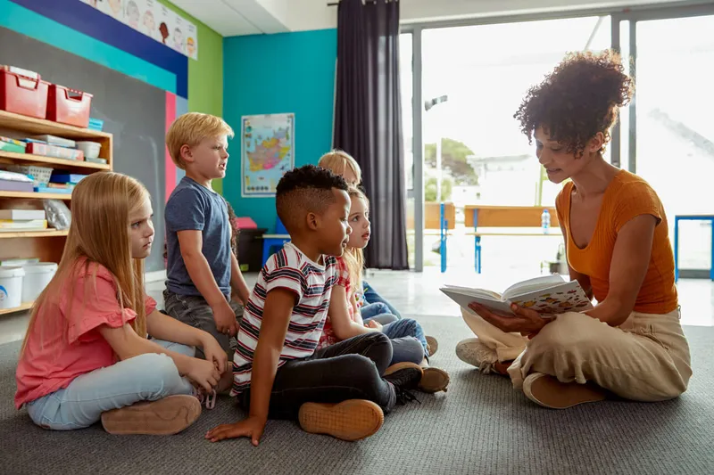
Age-Appropriate Colour Schemes for Gold Coast Schools
The age of the user plays a significant role in how colour is experienced and interpreted. Early learners in Gold Coast primary schools may benefit from more vibrant and contrasting palettes to stimulate engagement, whereas older students — particularly in secondary environments — often respond better to more muted or mature tones.
For adolescent users, subdued blues, warm greys, sage greens and neutral tones can help reduce visual noise and support concentration. Where intensity is introduced — such as in breakout areas or informal zones — colour may be used as an accent rather than a dominant scheme, particularly in Queensland’s bright, naturally-lit learning environments.
Zoning Through Colour
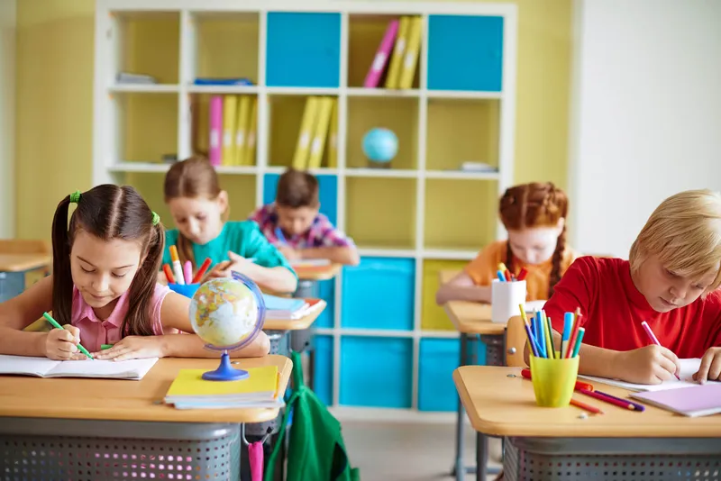
Colour can play a valuable role in zoning open or multi-use learning spaces. Rather than relying solely on walls to define zones, architects may use shifts in colour, texture, or materiality to signal the function of a space.
Strategic Color Zoning
Some common strategies include:
- Warm tones in active or collaborative zones to promote energy and engagement across Gold Coast school learning hubs
- Cool or desaturated tones in quiet or individual learning zones to enhance concentration in study areas
- Subtle colour differentiation between year levels or faculties to support identity and wayfinding throughout Queensland education facilities
These approaches help organise space visually, supporting both intuitive navigation and mood regulation for students and staff.
Supporting Neurodiverse and Sensory-Sensitive Users
Schools across the Gold Coast increasingly support a diverse cohort of learners, including neurodivergent students who may be more sensitive to environmental stimuli. For these students, colour and pattern choices can significantly influence comfort, focus, and emotional regulation.
Inclusive Color Design
To support inclusive design, colour schemes may include:
- Low-stimulation palettes with minimal contrast for sensory-sensitive areas
- Natural tones and textures to reduce visual clutter in learning spaces
- Soft transitions between zones rather than abrupt changes throughout the school environment
- Consistency in finishes to reduce disorientation in transition spaces
These considerations are important when developing design strategies for Gold Coast educational settings, particularly when aiming to support sensory inclusivity — which benefits all users, not only those with specific needs.
Staff Spaces and Colour Psychology

Colour choices for teacher and administration spaces also require thoughtful consideration. Staff often move between high-stimulation classroom environments and quieter zones for preparation or collaboration. Colour can help provide contrast, signal respite, and support cognitive clarity.
Tip
In shared staff zones or planning areas, neutral base palettes complemented by calming greens or blues can promote focus and reduce visual fatigue. Warmer tones may be used in social spaces to encourage interaction and create a welcoming atmosphere.
In all cases, staff spaces should contrast the sensory demands of student areas — offering relief rather than more stimulation. This is particularly important in busy Gold Coast Queensland schools where teachers need restorative spaces during their workday.
Connection to Context and Identity
We also believe that colour should respond to the natural and cultural context of a site, as well as a school’s identity. For coastal schools on the Gold Coast, palettes inspired by the landscape — warm sand tones, ocean blues, weathered timber greys — can reflect a sense of place. Urban campuses may opt for bold, graphic colours that reflect energy, diversity, or civic pride.
When used thoughtfully, colour can also reflect school values or provide opportunities for student involvement in the design process — for example, through the selection of accent colours, murals, or custom graphics that enhance engagement and pride in Queensland’s diverse educational communities.
Colour + Light: A Quick Note on Temperature
Light and Color Interaction
Lighting significantly impacts how colour is experienced. Warm white lighting (2700–3000K) can help create a sense of comfort and connection, while cooler lighting (4000–5000K) supports alertness and clarity in task-oriented zones.
Daylight is always preferable where possible — though architects must also consider glare, reflection, and artificial light balance when colour is applied in spaces used at varying times of day. This is particularly relevant for Queensland’s subtropical climate, where abundant natural light must be carefully managed to work harmoniously with interior color schemes.
Our Approach to Colour at Burleigh Beach Designs
Having worked in Queensland classrooms for over two decades, I’ve witnessed firsthand how color affects student behavior and engagement. What might seem like a simple aesthetic choice can dramatically influence a child’s ability to focus, regulate emotions, and engage with learning. When we collaborate with architects at Burleigh Beach Designs on color strategies, we’re really designing for the cognitive and emotional needs of diverse learners.
At Burleigh Beach Designs, we see colour as an integral part of how a space performs — not just how it looks. In education settings across the Gold Coast, we believe colour selection should be grounded in both functionality and research, with a focus on user wellbeing, spatial clarity, and long-term usability.
Informed by our broader experience designing civic and community-focused spaces throughout Queensland, our approach considers:
- How different space types could benefit from varied tones and levels of stimulation
- Opportunities to integrate colour into joinery, furniture and flooring in purposeful ways
- Consultation with school stakeholders to reflect pedagogy, identity and context
- Long-lasting colour strategies that support clarity and comfort over time
Our focus is always on creating spaces that feel cohesive, supportive, and tailored to their users — and colour plays a key role in achieving that for Gold Coast educational facilities.
In Summary
Colour has the power to shape learning environments in meaningful ways — supporting mood, attention, wellbeing and identity. For students, it can make the difference between overstimulation and calm. For teachers, it contributes to comfort and clarity. For school communities, it reinforces values and connection to place.
As specialist Gold Coast Queensland architects with expertise in educational design, we view colour as a tool for enhancing educational outcomes — one that works in tandem with layout, light, and materiality to support a rich, inclusive, and productive learning environment throughout Queensland’s educational facilities.
Note
About the Author: Simone McDonald brings over 20 years of valuable education sector experience to Burleigh Beach Designs. Before joining our team, she worked extensively within the education system, developing a deep understanding of how physical environments impact learning outcomes. Her unique perspective helps bridge the gap between architectural theory and practical educational needs, particularly in the thoughtful application of color in learning environments.
Continue Exploring Educational Design
This article is Part 2 of our four-part series on designing effective educational environments. Continue your exploration of how thoughtful architectural design enhances learning outcomes:
- Part 1: Acoustics – Designing for Clarity, Concentration and Connection
- Part 2: Colour Psychology – Designing Visual Environments That Support Learning, Mood and Focus (Current Article)
- Part 3: Coming Soon – Collaborative Spaces: Balancing Openness and Structure
- Part 4: Coming Soon – Technology Integration: Designing for Current and Future Needs
References
Academic Sources
-
Küller, R., Ballal, S., Laike, T., Mikellides, B., & Tonello, G. (2006). The impact of light and colour on psychological mood: A cross-cultural study of indoor work environments. Ergonomics, 49(14), 1496–1507. https://doi.org/10.1080/00140130600858142
-
Dazkir, S. S., & Read, M. A. (2012). Furniture forms and their influence on our emotional responses toward interior environments. Environment and Behavior, 44(5), 722–732. https://doi.org/10.1177/0013916511402063
-
Mehta, R., & Zhu, R. J. (2009). Blue or red? Exploring the effect of color on cognitive task performances. Science, 323(5918), 1226–1229. https://doi.org/10.1126/science.1169144
-
Li, D., & Sullivan, W. C. (2016). Impact of views to school landscapes on recovery from stress and mental fatigue. Landscape and Urban Planning, 148, 149–158. https://doi.org/10.1016/j.landurbplan.2015.12.015
-
Adams, F. M., & Osgood, C. E. (1973). A cross-cultural study of the affective meanings of color. Journal of Cross-Cultural Psychology, 4(2), 135–156. https://doi.org/10.1177/002202217300400201
Return to Insights to discover more architectural perspectives from Burleigh Beach Designs.
Working on an educational project that requires thoughtful color strategy on the Gold Coast? Contact our team to discuss how our experienced Gold Coast Queensland architects can develop custom color strategies and comprehensive educational design solutions tailored to your specific project needs.